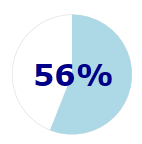
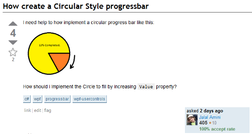
This blog post describes how to re-template the Silverlight ProgressBar control to render a circular progress indicator. This approach uses an attached view model to circumnavigate some of the limitations of the ProgressBar design.
This blog post describes the creation of the following funky styles for the ProgressBar (and a bit of a rant about just what is wrong with the way that 'lookless' controls work!)
If you get sick of the spinning, click the pause button!
Introduction
A few days ago I answered a question on stack overflow which asked How create a Circular Style progressbar? (sic)
The answer which I gave, and most people seemed to agree with, was that to achieve this you would have to create your own control from 'scratch'. I was happy that my answer was accepted, but at the same time a little unhappy that this should be the right answer. After all, Silverlight / WPF give you the power to create 'lookless' controls, and what is a circular progress bar if it isn't just another skin or 'look' for the regular progress bar?
What is wrong with the ProgressBar?
If you look at the documentation for styling / templating the ProgressBar you will find that this control expects the template to contain two elements, ProgressBarTrack and ProgressBarIndicator:
What the ProgressBar does is, when the template is applied, in OnApplyTemplate, it locates the elements with the given names in order to update the visual state of the UI. You can use Reflector (quick, while it is still free!) to see how the state of these elements is updated in the ProgressBar.SetProgressBarIndicatorLength method:
private void SetProgressBarIndicatorLength()
{
    double minimum = base.Minimum;
    double maximum = base.Maximum;
    double num3 = base.Value;
    if ((this.ElementTrack != null) && (this.ElementIndicator != null))
    {
        FrameworkElement parent = VisualTreeHelper.GetParent(this.ElementIndicator) as FrameworkElement;
        if (parent != null)
        {
            double num4 = this.ElementIndicator.Margin.Left + this.ElementIndicator.Margin.Right;
            Border border = parent as Border;
            if (border != null)
            {
                num4 += border.Padding.Left + border.Padding.Right;
            }
            else
            {
                Control control = parent as Control;
                if (control != null)
                {
                    num4 += control.Padding.Left + control.Padding.Right;
                }
            }
            double num5 = (this.IsIndeterminate || (maximum == minimum)) ? 1.0 : ((num3 - minimum) / (maximum - minimum));
            double num6 = Math.Max((double) 0.0, (double) (parent.ActualWidth - num4));
            this.ElementIndicator.Width = num5 * num6;
        }
    }
}
You can see in the above code that the various properties of the ElementTrack and ElementIndicator elements (the two named elements in the template) are being updated programmatically. This basically restricts the re-templating capabilities of the ProgressBar to ones where the 'indicator' element has a width which is some proportion of its parent element. That is not very lookless!
So what is so bad about creating your own circular progress indicator from scratch? Firstly, there is the issue of object-oriented design principles and re-use. Secondly, and in my opinion much more importantly, is how this affects skinning. Templating allows you to radically change your UI simply by applying a new set of styles, see for example the Silverlight Toolkit Themes. Styles can change the value of any property of an element (including its template) but they cannot change the class itself! So, if you create a circular progress bar as a new control, you cannot interchange it with the standard ProgressBar simply by applying a theme.
An Attached View Model
OK, rant over. Time to fix the problem!
A few months ago I blogged about how to create completely lookless controls using an attached view model. The basic concept behind this approach is that the control itself should not include any logic which is tightly-coupled to a particular template, or 'look'. This logic is still required, but is instead introduced into the template by means of an attached view model.
Typically the elements within a control's template inherit the same DataContext as the control itself, i.e. whatever business object or view model you have bound to your UI. With the attached view model approach, a view model is attached to the root element in the template. On attachment, this view model acquires a reference to the ProgressBar, in order to adapt its properties, making it easier to render a circular indicator, and sets itself as the DataContext of the child elements:
The view model is attached in XAMl as follows, as a result the DataContext of any element within the template is now the view model:
<ControlTemplate TargetType="ProgressBar">
  <Grid x:Name="LayoutRoot">
    <!-- attach the view model -->
    <local:CircularProgressBarViewModel.Attach>
      <local:CircularProgressBarViewModel/>
    </local:CircularProgressBarViewModel.Attach>

    <!-- the rest of the template now has CircularProgressBarViewModel as the DataContext -->
  </Grid>
</ControlTemplate>
Becoming Attached
The changed handler for the Attach property is given below. In summary, on attachment, the view model sets itself as the DataContext for the element it has been attached to. It then handlers the Loaded event which fires when the UI is fully constructed in order to locate the ProgressBar using Linq to VisualTree:
/// <summary>
/// Change handler for the Attach property
/// </summary>
private static void OnAttachChanged(DependencyObject d, DependencyPropertyChangedEventArgs e)
{
  // set the view model as the DataContext for the rest of the template
  FrameworkElement targetElement = d as FrameworkElement;
  CircularProgressBarViewModel viewModel = e.NewValue as CircularProgressBarViewModel;
  targetElement.DataContext = viewModel;

  // handle the loaded event
  targetElement.Loaded += new RoutedEventHandler(Element_Loaded);
}

/// <summary>
/// Handle the Loaded event of the element to which this view model is attached
/// in order to enable the attached
/// view model to bind to properties of the parent element
/// </summary>
static void Element_Loaded(object sender, RoutedEventArgs e)
{
  FrameworkElement targetElement = sender as FrameworkElement;
  CircularProgressBarViewModel attachedModel = GetAttach(targetElement);

  // find the ProgressBar and associated it with the view model
  var progressBar = targetElement.Ancestors<ProgressBar>().Single() as ProgressBar;
  attachedModel.SetProgressBar(progressBar);
}
Once the view model is associated with the progress bar, it is able to compute properties which assist in the creation of a circular template, e.g. the angle used to represent a particular progress value.
/// <summary>
/// Add handlers for the updates on various properties of the ProgressBar
/// </summary>
private void SetProgressBar(ProgressBar progressBar)
{
  _progressBar = progressBar;
  _progressBar.SizeChanged += (s, e) => ComputeViewModelProperties();
  RegisterForNotification("Value", progressBar, (d,e) => ComputeViewModelProperties());
  RegisterForNotification("Maximum", progressBar, (d, e) => ComputeViewModelProperties());
  RegisterForNotification("Minimum", progressBar, (d, e) => ComputeViewModelProperties());

  ComputeViewModelProperties();
}


/// Add a handler for a DP change
/// see: http://amazedsaint.blogspot.com/2009/12/silverlight-listening-to-dependency.html
private void RegisterForNotification(string propertyName, FrameworkElement element, PropertyChangedCallback callback)
{

  //Bind to a dependency property
  Binding b = new Binding(propertyName) { Source = element };
  var prop = System.Windows.DependencyProperty.RegisterAttached(
      "ListenAttached" + propertyName,
      typeof(object),
      typeof(UserControl),
      new PropertyMetadata(callback));

  element.SetBinding(prop, b);
}
Thanks to Anoop for publishing a nice and simple method for registering for change notification of dependency properties (what a pain that DPs do not also implement the INotifyPropertyChanged pattern!).
Each time one of the properties on the progress bar changes, the following method updates a few of the CLR properties exposed by the attached view model:
/// <summary>
/// Re-computes the various properties that the elements in the template bind to.
/// </summary>
protected virtual void ComputeViewModelProperties()
{
  if (_progressBar == null)
    return;

  Angle = (_progressBar.Value - _progressBar.Minimum) * 360 / (_progressBar.Maximum - _progressBar.Minimum);
  CentreX = _progressBar.ActualWidth / 2;
  CentreY = _progressBar.ActualHeight / 2;
  Radius = Math.Min(CentreX, CentreY);
  Diameter = Radius * 2;
  InnerRadius = Radius * HoleSizeFactor;
  Percent = Angle / 360;
}
The complete XAML for one of the styled progress bars seen at the top of this blog post is given below. Here you can see how the various UI elements within the template are bound to the attached view model:
<Style TargetType="ProgressBar" x:Key="PieProgressBarStyle">
  <Setter Property="Template">
    <Setter.Value>
      <ControlTemplate TargetType="ProgressBar">
        <Grid x:Name="LayoutRoot">
          <!-- attach the view model -->
          <local:CircularProgressBarViewModel.Attach>
            <local:CircularProgressBarViewModel HoleSizeFactor="0.75"/>
          </local:CircularProgressBarViewModel.Attach>

          <!-- a circular outline -->
          <Ellipse Width="{Binding Diameter}" Height="{Binding Diameter}"
                    HorizontalAlignment="Center" VerticalAlignment="Center"
                    Stroke="LightGray" Fill="Transparent"
                    StrokeThickness="0.3">
          </Ellipse>

          <!-- a pie-piece that indicates the progress -->
          <local:PiePiece CentreX="{Binding CentreX}" CentreY="{Binding CentreY}"
                          RotationAngle="0" WedgeAngle="{Binding Angle}"
                          Radius="{Binding Radius}" Fill="LightBlue"/>

          <!-- progress as a percent -->
          <Grid util:GridUtils.RowDefinitions="*,3.5*,*"
                util:GridUtils.ColumnDefinitions="*,3.5*,*">
            <TextBlock Text="{Binding Percent, StringFormat=0%}"
                        Foreground="DarkBlue"
                        FontWeight="Bold" FontSize="20"
                        Grid.Row="1" Grid.Column="1"
                        VerticalAlignment="Center" HorizontalAlignment="Center"/>
          </Grid>
        </Grid>
      </ControlTemplate>
    </Setter.Value>
  </Setter>
</Style>
(The template uses a PiePiece is a control I borrowed from a PieChart control I created a few years back, and the simplified Grid syntax)
We now have a circular ProgressBar! ...

Segmented Progress Bar
For a bit of fun I extended the attached view model to allow for the easy construction of circular progress bar sthat are rendered as discrete segments. The SegmentedProgressBarViewModel, which is attached to the template exposes a collection of objects which allow the creation of a segmented indicator via an ItemsControl. For full details,download the blog sourcecode.
<Style TargetType="ProgressBar" x:Key="SegmentedProgressBarStyle">
  <Setter Property="Template">
    <Setter.Value>
      <ControlTemplate TargetType="ProgressBar">
        <Grid x:Name="LayoutRoot">
          <!-- attach the view model -->
          <local:CircularProgressBarViewModel.Attach>
            <local:SegmentedProgressBarViewModel HoleSizeFactor="0.7"/>
          </local:CircularProgressBarViewModel.Attach>

          <!-- render the segments -->
          <ItemsControl ItemsSource="{Binding Segments}">
            <ItemsControl.ItemsPanel>
              <ItemsPanelTemplate>
                <Grid/>
              </ItemsPanelTemplate>
            </ItemsControl.ItemsPanel>
            <ItemsControl.ItemTemplate>
              <DataTemplate>
                <Grid>
                  <!-- a grey segment -->
                  <local:PiePiece CentreX="{Binding Parent.CentreX}" CentreY="{Binding Parent.CentreY}"
                            RotationAngle="{Binding StartAngle}" WedgeAngle="{Binding WedgeAngle}"
                            Radius="{Binding Parent.Radius}" InnerRadius="{Binding Parent.InnerRadius}"
                            Fill="LightGray" Stroke="White" Opacity="0.5"/>
                  <!-- a blue segment, with an Opacity bound to the view model -->
                  <local:PiePiece CentreX="{Binding Parent.CentreX}" CentreY="{Binding Parent.CentreY}"
                            RotationAngle="{Binding StartAngle}" WedgeAngle="{Binding WedgeAngle}"
                            Radius="{Binding Parent.Radius}" InnerRadius="{Binding Parent.InnerRadius}"
                            Fill="DarkBlue" Stroke="White" Opacity="{Binding Opacity}"/>
                </Grid>
              </DataTemplate>
            </ItemsControl.ItemTemplate>
          </ItemsControl>
        </Grid>
      </ControlTemplate>
    </Setter.Value>
  </Setter>
</Style>
The above markup results in the following style:

The sourcecode for this blog includes a few other styles, including a 'glass' effect which was borrowed from Pete Brown's blog post on Pie chart styling.
Sourcecode
You can download the full sourcecode for this blog post: CircularProgressBar.zip
Regards, Colin E.


